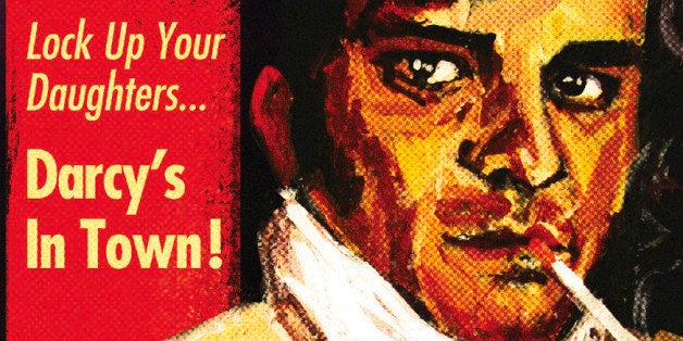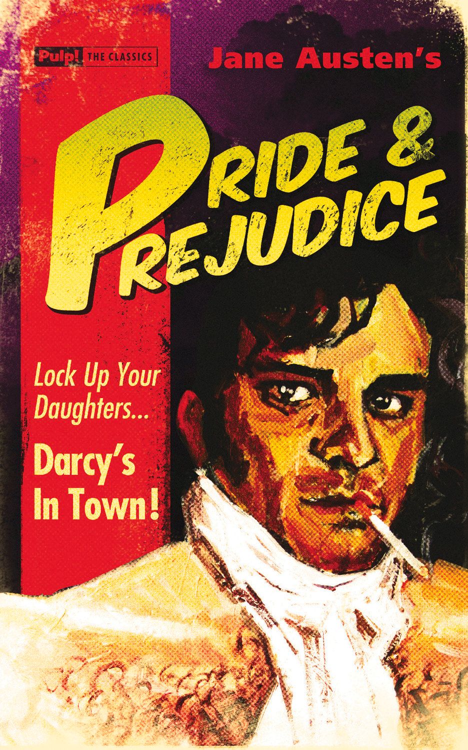
We absolutely love the Pulp! the Classics series that IPG is debuting in the U.S. this month ("Pride & Prejudice," "The Hound of the Baskervilles" and "Robinson Crusoe" come this month, the other two come out in November). They take classic books and redesign the covers so that they look like vintage pulp novels. We e-mail chatted with the cover designers, David Mann and Elsa Mathem for our recurring feature "Under the Covers."
In your own words, what are these books about?
David: We’re repackaging classic texts! So everything.
What was the mood, theme or specific moment from the text you depicted with these covers?
David: We’re aiming to emulate vintage pulp covers, so actually referring to the text with any sensitivity or fidelity goes out of the window. This generates much of the humor – you can see old pulp covers where the artist obviously had a very shallow appreciation of the text – Sherlock Holmes looking more like James Dean, wrong costume, wrong setting etc. It’s pretty funny, though I assume these original pulp jackets weren’t necessarily going for the laughs first time around.
What inspires your design?
David:I looked through some lovely anthologies of pulp paperbacks, and got a feel for the kind of style and attitude that prevailed back in the 50s & 60s. This was actually quite daunting, as there were some terrific commercial artists working in those days. Alas, their technique was far better than my own. Two books I perused in particular were "Dope Menace" and "Straight From The Fridge Dad." Though pulps are rightly regarded as lurid and down-market, you’ll see if you look through these examples, many of these illustrators often painted to a high standard, and had a pretty slick technique.
Elsa: Where the inspiration would come from for this series was clear from the project brief. The idea was to create pulp-inspired covers for classic books. I was already familiar with pulp paperbacks as I have a keen interest on the design of that era and had done some research while working on the re-edition of" Straight From the Fridge, Dad" (which I designed for the same publisher). I went back to this book and (online) pulp cover galleries for inspiration and added to these the artwork Dave had made for the first book ("Pride and Prejudice").
What is your previous design experience, with books and otherwise?
David: I’ve worked previously as an Illustrator for both publishers, and corporate clients, but these are the first covers I’ve worked on.
Elsa: I have been designing books (inside and out) for independent publishers in the UK, U.S. and France for 10 years. I also occasionally work on brand/company identity and communication for a few corporate clients.
What was the biggest challenge in designing these covers?
David:It was difficult to decide on the type of humor to go for. We opted for silly! Hence the incongruous cigarettes in mouths of characters such as Mr. Darcy. Some people have subsequently expressed their annoyance at this, and would have liked something more subtle, but we were never going to please everybody. I also had to try and improve my technique as an illustrator.
Elsa: Fitting everything on the cover!
Did you consider different ideas or directions for these covers? Why were these rejected? Do you have a favorite amongst them? Are you happy with the final decisions as it ran?
David: Yes, there were plenty of alterations and rejections and re-submissions of artwork. In the end, even book buyers in the UK trade were allowed some input, so it sometimes felt like every idea could be vetoed at any second by one of any number of people. I’ve attached the original artwork for "Tess of the d’Urbervilles." This was rejected as people thought she looked too much like she was sitting on the toilet! The face was based on Mae West on this version, and I was asked to upgrade to Monroe! We also argued over the breed of dog for "Hound of the Baskervilles"- I preferred a poodle, but the killer Chihuahua made it on to the cover.
Elsa: The approval of the series design was quick and straightforward. Now that the design is in place, the covers are all Dave's, and so are the ideas, rejections alterations etc. Once the artwork is approved, I fit the text and work on the color palette & effects for each book.
What is the most important element of a successful book cover?
David: It should be beautiful. A good book cover should not be tripping over itself trying to convey every facet of the story that the book contains, but rather the statement should be kept simple. With Pulp The Classics it’s a bit different, the humor is the unique selling point, and therefore most important.
Elsa: To get your attention. Hopefully it will do more, but it is the first and most important thing a cover should do.
What are some of your favorite book covers?
David:Oh I have lots and wouldn’t know where to start. Mid 20th century are my fave, probably stuff with illustration and lithographs rather than photography. In the UK you can see a lot of current titles emulating this period, along with a resurgence in hand-rendered typography – I like it.
Elsa: There are many, Paul Rand's "Goodbye Columbus" (1959, Meridian Fiction), John Gall's "Lolita" (1989, Vintage), Jamie Keenan's "Never Let Me Go" (2006, Vintage), Rodrigo Corral's "Rant" (2007, Doubleday), David Pearson's "Great Ideas" series (1999-2009, Penguin), Coralie Bickford-Smith's F. Scott Fitzgerald Classics series (2010-2011, Penguin)... On the pulp-inspired front, Chip Kidd's "Early James Ellroy" series ("Because the Night," 2005; "Blood on the Moon," 2005; "Suicide Hill," 2006; all Vintage).
Do you judge books by their covers?
David: Frequently!
Elsa: Absolutely. And judging by the titles I listed above, it usually works out. Some great books have terrible covers but I can't remember ever buying a terrible book which had a great cover. Maybe I have just been lucky.
