
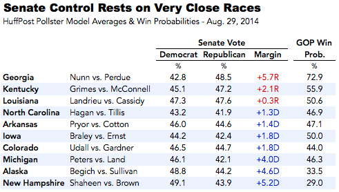
WASHINGTON -- With just over nine weeks remaining before Election Day 2014, the contest for control of the U.S. Senate likely hinges on the outcome of a half-dozen races that remain remarkably close, according to the latest public polls.
In estimates based on all available public polls compiled by HuffPost Pollster, the Democratic and Republican candidates are separated by less than 2 percentage points in five states: Arkansas, Colorado, Iowa, Louisiana and North Carolina. Four more states -- Alaska, Georgia, Kentucky and Michigan -- feature hotly contested races where Pollster estimates give the leaders slightly greater margins, but where either candidate has a real chance of winning.
The current results reflect some important changes in the charts and model-based polling estimates published by HuffPost Pollster, including a new "win probability" statistic on each chart. We will be launching a more complete U.S. Senate forecast just after Labor Day, but for now here are more details on the changes that go into effect Aug. 29.
THE BASIC POLL AVERAGING MODEL
HuffPost Pollster begins by collecting every publicly released poll that asks a candidates' horse race question of potential voters and then displays the percentages for each candidate on each poll in an interactive chart. We use a statistical model, originally developed by Stanford University professor Simon Jackman, to estimate the trend in support for each candidate based on all the survey data.
As we explained last year, the tracking model has several advantages over simple averaging. For one, not all polls contribute equally to our model's estimates because different polls have different sample sizes.
The model also helps correct for "house effects," the tendency for some polling organizations to produce estimates that are systematically higher or lower for one candidate than those of other pollsters. As we have implemented it until now, the correction pulls results toward the "industry average" for all pollsters (not polls) in each state. If a single pollster does a lot of polling and shows a consistent house effect, our model will reduce the impact of those surveys on the overall estimate.
By running a series of simulations (known commonly as the Monte Carlo method), the model allows us to quantify the uncertainty associated with the current polling snapshot. That uncertainty comes from multiple sources: sampling error in the polls themselves, uncertainty about the house effect corrections, and uncertainty about how quickly vote intentions are changing.
The HuffPost Pollster charts represent the uncertainty in the form of colored bands around each trend line that show the potential variation in each estimate. For example, as of this writing, the chart for the Iowa Senate race shows Democrat Bruce Braley with a slight advantage over Republican Joni Ernst (44.2 percent to 42.4 percent). The model tells us that there is a 95 percent probability that the current snapshot of voter support falls between 41.3 percent and 47.2 percent for Braley and between 39.3 percent and 45.6 percent for Ernst. Since these confidence bands overlap, we cannot say with statistical confidence that Braley is leading Ernst.
COMPUTING A WIN PROBABILITY
Until our latest changes, the HuffPost Pollster charts also noted the probability that the leading candidate is really ahead -- a number that describes the model's statistical confidence that the colored bands around each trend line do not overlap. Unfortunately, that statistic has proved to be misleading. Given the way the model combines the samples from multiple polls, relatively small margins can quickly produce a very high level of confidence in a statistically significant lead.
However, a small lead in the polling averages today may be fleeting. Voter preferences can change over the course of a campaign and, of course, polls themselves can be wrong. So beginning on Aug. 29, the HuffPost Pollster charts instead provide a "win probability" statistic that aims to take into account the potential for shifts in candidate support and the potential for error or statistical bias in polling estimates of candidate support.
We compute the win probability not because we believe polls can provide perfect predictions of the future. They cannot (although on the eve of an election, they should come very close). Rather, since so many political observers treat poll results as a forecast, our aim is to quantify the polls’ lack of precision in foretelling election outcomes, to put a real-world "margin of error" around the current polling snapshot.
The win probability calculation accounts for three factors that can lead to error.
First, it considers the time remaining between the current snapshot and the election. Behind the scenes, we run the poll model ahead to Election Day without the benefit of new survey data. In the absence of new data, the outcome becomes less certain. So simply put, the more time remaining in the campaign, the less certainty that a lead in the polls will translate into a win.
Second, the new calculation takes into account the possibility that the polls could be wrong or that some sort of major event could shake up a race in ways that the current polls can't measure -- similar to the adjustment applied by Jackman to the 2012 HuffPost model. This effort is complicated by the fact, recently highlighted by FiveThirtyEight's Nate Silver, that "when the polls have a bad year, they often make the same mistakes in a number of states, systematically underestimating the performance of Democratic or Republican candidates. That means you can have one election cycle, or several in a row, when the polls get almost every state right -- followed by another where there are misses all over the map. Another bad polling year might be lurking around the corner."
Since we have little guidance on how such a misfire could happen or in what direction it would affect the poll results, we try to adjust for the chance of misfires by adding completely random noise to the model that reduces the certainty of the estimates. This is achieved through a process called "jittering," a statistical term for introducing random variation into a variable or estimate. In our case, we want to introduce this random variance into the baseline standard for how much certainty the model should give the margin between the candidates. We want to randomly reduce the precision -- which, in effect, shrinks the win probability toward 50 without altering any other parts of the model.
Third, the win probability calculation adds an adjustment to account for the proportion of "undecided" voters in the polls. If the undecided proportion is high relative to the expected margin between the candidates, the outcome of that race must be less certain. So we systematically reduce our estimation of the certainty of the win for contests in which the undecided share of voters is larger than the margin between the candidates.
USING HOUSE EFFECTS TO CALIBRATE THE MODEL
A lot has changed about public polls since Pollster.com first launched eight years ago. In 2006, just under 3 percent of the 872 polls we tracked that measured U.S. Senate contests had partisan sponsorship (a campaign, party committee or PAC). Of the 480 Senate polls we have tracked so far in 2014, more than half either have partisan sponsors (25 percent) or were conducted by a polling firm with a partisan affiliation (35 percent).
Although the shift toward automated telephone and Internet polling was well underway by 2006, just under half of the surveys we tracked that year (49 percent) used live interviewers. This year, only 29 percent of the polls are live-interviewer telephone polls.
Perhaps most striking, just 14 percent of the Senate polls we have tracked this year were conducted by nonpartisan organizations using traditional live-interviewer phone methods.
These trends raise the potential for polling errors of greater magnitude than previously seen in off-year general elections. And why is that?
First, the rise of alternative methodologies has occurred at the same time Americans are increasingly abandoning landline phones. Since 2006, as tracked by the Centers for Disease Control and Prevention, the percentage of "cell phone only" Americans has grown from just under 10 percent to 39 percent, while another 18 percent now say they rarely use their landline phones and receive all or almost all of their calls on their mobile phones. Federal law bans automated telephone polls from using auto-dialers to call mobile phones. So both Internet surveys (which draw respondents from opt-in panels) and automated surveys (which are increasingly turning to online methods to reach cell-only households) must rely more heavily on weighting and modeling to correct the statistical bias in their raw data.
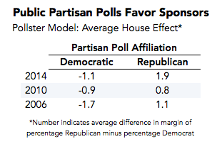
Second, results from publicly released partisan polls have always shown a consistent bias favoring their sponsors, mostly likely due to selective release -- that is, sponsors eagerly share good news but hold back the bad. So far in 2014, public polls conducted by Democrats have been about a percentage point more favorable to Democratic candidates; polls conducted by Republicans have been just under 2 percentage points more favorable to Republican candidates. These results are generally consistent with the house effects we see when back-testing our model against data from 2006 and 2010. Previous studies of polling error by Harry Enten, Charles Franklin and others have found a similar pattern.
The house effect correction that is an integral part of our polling model already pulled results toward the industry average for all pollsters. But the growth of partisan polls and surveys using nontraditional methodologies has created a far greater potential for bias in that average.
We have therefore added an additional house effect adjustment. The goal here is simple: to minimize the effects of partisan polls and pollsters with questionable reliability. So we calibrate the model's trend lines to better match estimates from the group of nonpartisan pollsters who were on average within plus-or-minus one percentage point of the trend lines generated by the HuffPost 2012 model after adjusting the model to the actual election results. The average of the polls conducted by these pollsters is calculated, and then the rest of the model is adjusted as if this average were the true average of all the polls. The individual pollsters in this nonpartisan group still have their own house effects, but the average of their house effects is zero. (Pollsters excluded from the calibration procedure are those with partisan affiliations as well as ARG, EPIC-MRA, Gravis Marketing, InsiderAdvantage, Mitchell Research, Purple Strategies, R.L. Repass & Partners, Rasmussen and Suffolk University.)
To reduce the effects of one-time polls that were conducted with a specific bias and whose results could be outliers, the model also groups those partisan pollsters who survey only once in a state into sets of Republican or Democratic pollsters.
At this point in the electoral year, many of the polling organizations used to calibrate our model are still reporting their registered-voter results, which traditionally lean Democratic. That means this additional house effect adjustment nudges the estimates in the Democratic direction for now -- but the difference is slight. As of this writing, the calibration increases the Democratic margin in the 16 Senate races for which we have poll charts by an average of 0.4 percentage points, although the effect is not uniform. The margin grows slightly more Democratic in 11 races and slightly more Republican in five. As the remaining polls switch in the next weeks from reporting results of registered voters to reporting results of likely voters, this pattern will probably fade.
Those in sum are the changes HuffPost Pollster is rolling out now. Stay tuned for our full Senate forecast after Labor Day.