Twitter may be full of jibber-jabber, but that doesn't mean this social networking site can't give us a little insight about what the world is thinking.
Silicon Graphics International, or SGI, has partnered with researchers from the University of Illinois to scan international tweets in a project dubbed the Global Twitter Heartbeat. By using SGI's UV 2000 Big Brain supercomputer, the researchers created real-time heat maps of positive and negative sentiments expressed via Twitter.
This means your angry/excited/nervous/happy tweets are possibly being recorded by an uber-speedy computer in order to stitch together an overall portrait of the Twittersphere's emotions.
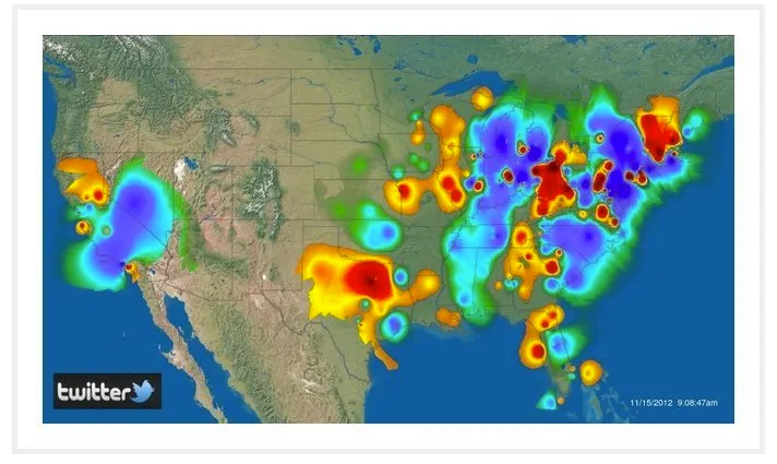
So how does it work? "The project analyses every tweet to assign location (not just GPS-tagged tweets, but processing the text of the tweet itself), and tone values and then visualizes the conversation in a heat map infographic that combines and displays tweet location, intensity and tone," SGI's Facebook page reads.
The Global Twitter Heartbeat tracks about 10 percent of the 500 million tweets posted daily -- that's approximately 50 million posts analyzed each day.
Thus far, SGI has created heat maps illustrating people's feelings on Twitter about Hurricane Sandy and the 2012 election night. To see the project in action, watch the clip below, showing how U.S. tweets were affected as the so-called "Frankenstorm" barreled up the East Coast in late October. (Red patches represent negative sentiments. Blue patches are positive.)
Gigaom notes the UV 2 supercomputer that's used to process all of this emotion-filled Twitter data is an "impressive machine with a maximum of 4,096 cores." A press release from SGI also states that the UV 2 could "ingest the entire contents of the U.S. Library of Congress print collection in less than three seconds."
What do you think about the Global Twitter Heartbeat project? Can you think of any other ingenious uses for these high-tech analyses? Let us know your thoughts in the comments section, or tweet us at [@HuffPostTech]. Then check out a Twitter heat map that shows which cities are more likely to tweet "good morning" vs. "f*uck you," or flip through the slideshow (below) to see what Twitter tells us about humanity.
Related
Before You Go
