Oh mother!
An old story about the famous McDonald’s arches logo is floating around the internet again, thanks to Foodbeast recently resurfacing tidbits from author Eric Schlosser’s 2001 bestseller, Fast Food Nation: The Dark Side of the All-American Meal.
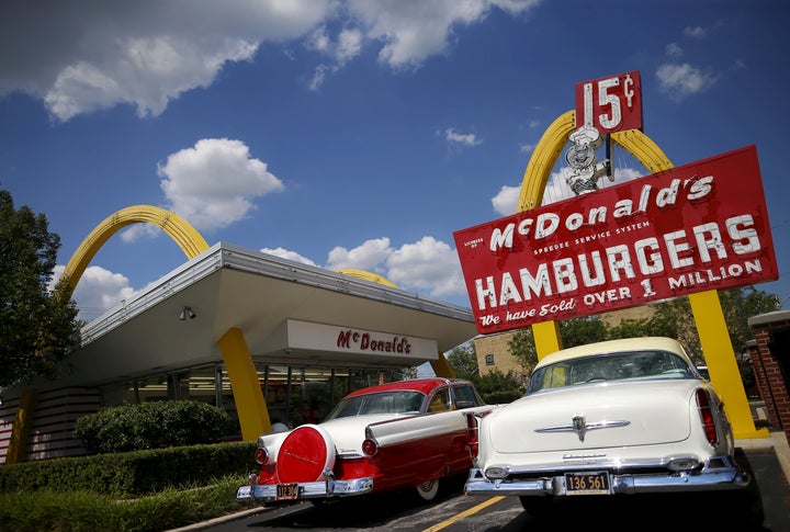
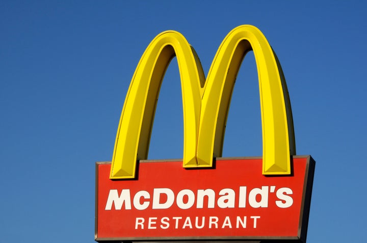
In the book, Schlosser delves into the psychology and history behind McDonald’s golden arches. He describes how the original symbol was two separate arches placed on either side of a McDonald’s building, but later they were placed together into the iconic “M” shape.

When McDonald’s was thinking about doing away with the arches in the 1960s, they hired design consultant and psychologist Louis Cheskin. Cheskin wisely instructed the chain to keep the arches, for a very interesting reason:
He argued against completely eliminating the golden arches, claiming they had a great Freudian importance in the subconscious mind of consumers. According to Cheskin, the golden arches resembled a pair of large breasts: “mother McDonald’s breasts.” It made little sense to lose the appeal of that universal, and yet somehow all-American, symbolism. The company followed Cheskin’s advice and retained the golden arches, using them to form the M in McDonald’s.
The design has stayed relatively the same ever since. McDonald’s didn’t respond to our request for confirmation on this tale, but one thing is for sure ― you’ll never look at those golden arches the same way ever again!

And here we thought those McDonald’s holiday cups were the most NSFW thing about the brand.
