The U.S. has substantially worse health outcomes than all its peer nations. In a list of non-communicable disease mortality in 17 high-resource countries, the U.S. has the second-highest death rate at 418 deaths per 100,000 people (Figure 1).
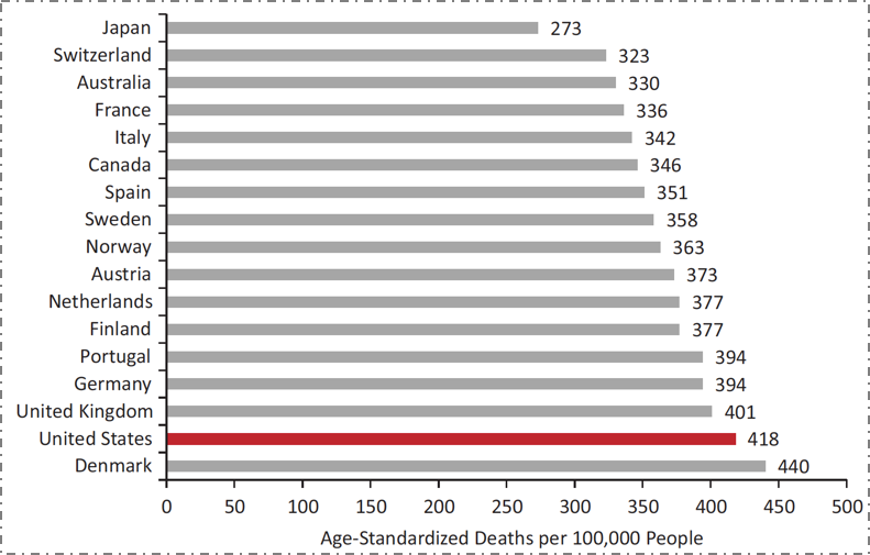
Figure 1. Mortality from noncommunicable diseases in 17 peer countries, 2008.
Data from World Health Organization. US Health in International Perspective. Shorter lives, poorer health. S Woolf, L Aron, eds. NRC and IOM. 2012.
Although American life expectancy has improved over time along with that of other countries, it has improved at a slower rate, resulting in the US falling substantially behind our peers. But this has not always been the case. Take the example of female life expectancy at birth (Figure 2). The U.S. was in the middle of the group of peer countries as recently as 1980. However, in the intervening 35 years, while all countries have improved, we have fallen behind, improving at a far slower rate.
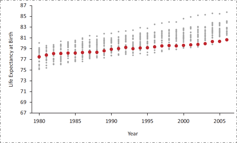
Figure 2. US female life expectancy at birth relative to 21 other high-income countries, 1980--2006.
Data from the National Research Council, 2011. US Health in International Perspective. Shorter lives, poorer health. S Woolf, L Aron, eds. NRC and IOM. 2012.
Our underperformance is not the result of a lack of investment in health. The U.S. spends far more on health than any of our peer countries, and our rate of spending is increasing (Figure 3).

Figure 3. Average health care spending per capita, 1980--2009, adjusted for differences in cost of living.
Data from OECD Health Data 2011. The Commonwealth Fund. http://www.commonwealthfund.org/~/media/files/publications/fund-report/2014/jun/1755_davis_mirror_mirror_2014.pdf Accessed May 30, 2016.
What, then, does this spending get us? Improvement, as it happens, in one very specific area. While we have the worst mortality outcomes among our peer set throughout most of the life course, at the very end of the life course we actually move to the best (Figure 4). It turns out that the US has the best health indicators for those over 80 years old; this however has come at the expense of the cost of health for all other ages. Our enormous expenditures on all forms of medical care, including end-of-life care, result in suitably commensurate health indicators at the upper extreme of life, while our comparative lack of spending on the social, economic, and environmental conditions that actually determine health has resulted in us having worse health indicators than our peer nations for all but the oldest age groups.
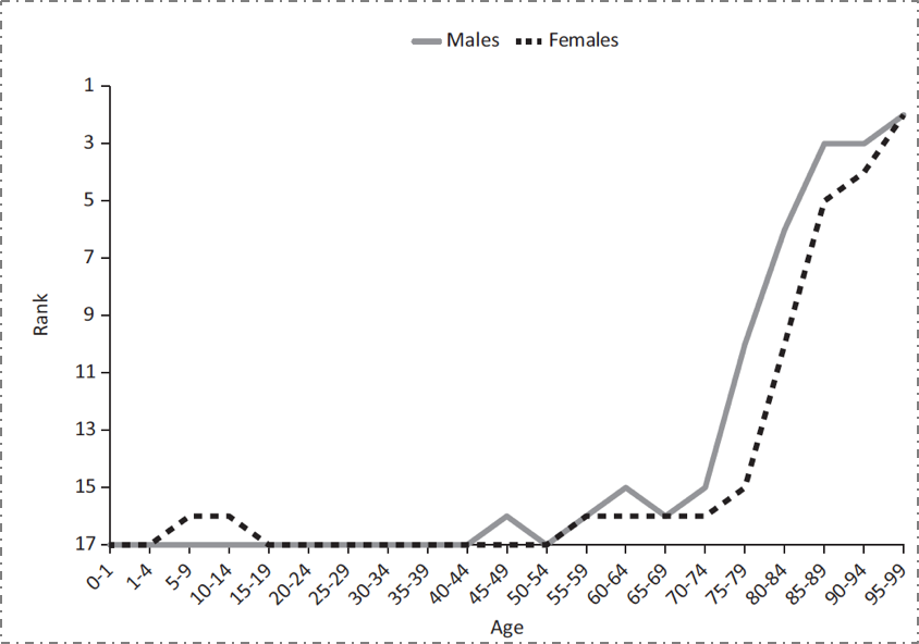
Figure 4. Ranking of U.S. mortality rates, by age group, among 17 peer countries, 2006--2008.
Adapted from Ho and Preston, 2011. US Health in International Perspective. Shorter lives, poorer health. S Woolf, L Aron, eds. NRC and IOM. 2012.
These health challenges are even present in Boston, the city with the highest proportion of physicians compared with any other city in the US. Figure 5 shows the percentage of adults living with diabetes in various neighborhoods in the city, all within just a few miles of each other. The diabetes prevalence among residents of Maverick, Dudley Square, and Mattapan are 3-4 times greater than those of the wealthier areas around Back Bay and Fenway.

Figure 5. Percent of adults with diabetes by T stop, 2010.
Data from Health of Boston 2012--2013: A neighborhood focus. Boston Public Health Commission.
http://www.bphc.org/healthdata/health-of-boston-report/Pages/Health-of-Boston-Report.aspx Accessed May 30, 2016.
The stark variation in diabetes prevalence in these neighborhoods belies the presence of the often world-class medical facilities close to all of these areas (Figure 6). This reinforces the reality that deep-seated inequalities in health cannot be fixed by medical care alone. While issues of access and cost, among many other factors, contribute to less economically advantaged Boston residents not being able to fully capitalize on the medical facilities that surround them, this is only one relatively small part of the challenge. To truly improve the wellbeing of populations, we need an "all in" engagement with the foundational determinants of health, and a willingness to invest in improving these conditions.

Figure 6. Medical facilities near T-stops.
Compiled using Google Maps.
This investment is necessary because the production of health is driven by factors across the lifecourse and across levels of influence. It is difficult to quantify the degree to which these various levels influence health; however, the Network for Excellence in Health Innovation estimates that a large majority of health is determined by our environments and behaviors ( Figure 7). According to the NEHI, only about 6 percent of the production of health is attributable to medical care or access to medical care. This of course is in sharp contrast with our spending: almost 90 percent of our national health expenditure is spent on medical services.

Figure 7. The spending mismatch: Health determinants vs. health expenditures.
Healthy People/Healthy Economy: An Initiative to Make Massachusetts the National Leader in Health and Wellness. 2015. Data from NEHI 2013.
http://www.tbf.org/tbf/56/hphe/Health-Crisis Accessed May 30, 2016.
This speaks directly to the mission of public health--to focus on the social, economic, and cultural conditions that make populations healthy. Such a focus means, to an extant, moving away from the curative approach that characterizes the US investment in "health" towards a greater investment in the foundational determinants of wellbeing. This does not mean increasing spending; it means spending more strategically on the foundational conditions that shape the health of populations. The need for this new approach is well illustrated by Figure 8 below.
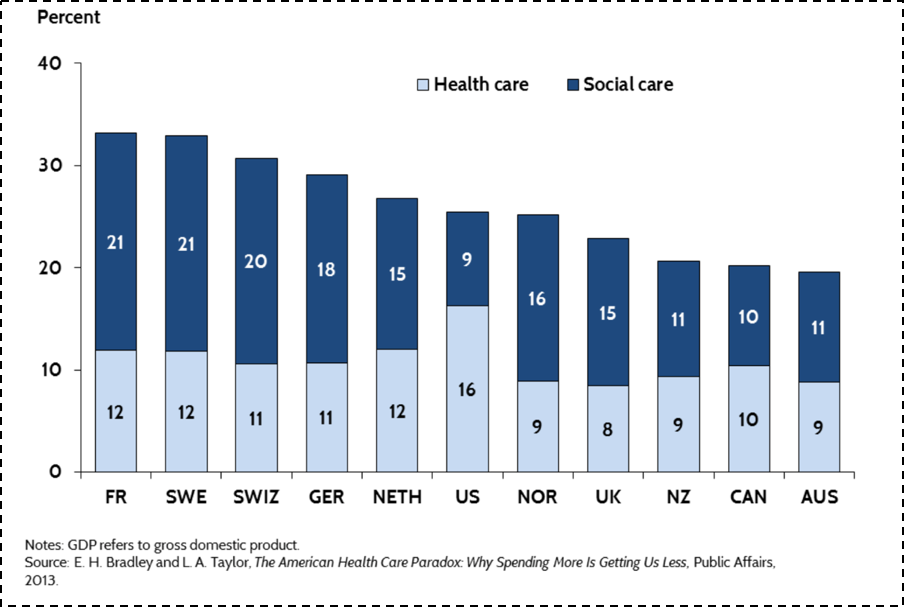
Figure 8.
The Commonwealth Fund. U.S. Health Care from a Global Perspective. http://www.commonwealthfund.org/publications/issue-briefs/2015/oct/us-health-care-from-a-global-perspective Accessed May 30, 2016.
When one combines spending both on medical care (and I would argue that the light blue bar above would be better labeled "medical care" than "health care"), with a broad range of social investments in the resources that can shape the health of populations (above labeled "social care"), U.S. spending is roughly in the middle of the pack compared to peer nations. We are spending more on medical, curative care, but far less than other nations on building the conditions that make people healthy.
This narrative is true both in the national and the local context. Returning to Massachusetts, we have seen government medical spending increase by 81 percent over the past decade and a half (Figure 9). Unfortunately, as we have spent more money on medical care, we have spent less on the larger determinants of health such as education, early childhood care, the environment, and even public health. While there is clearly a growing global appreciation of the centrality of the social determinants of health, this appreciation is far from reflected in how we as a Commonwealth have been allocating our resources.

Figure 9. Change in Massachusetts state government spending, 2001--2014.
Healthy People/Healthy Economy: An Initiative to Make Massachusetts the National Leader in Health and Wellness. 2015. Data from Massachusetts Budget and Policy Center Budget Browser. http://www.tbf.org/tbf/56/hphe/Health-Crisis Accessed May 30, 2016.
Our collective investment in a curative approach--in the health of individuals, as opposed to the health of populations--extends well beyond our increased spending on medical care. Our research enterprise has, over the past decade, focused more and more on funding individual approaches, moving us away from scholarship around the foundational determinants of population health. With the rise of genomics, and most recently the Precision Medicine effort, much of that funding has driven efforts aimed at genetic and molecular targeting. This research comes at a cost, specifically the price of funding population health. As calculated through the National Institutes of Health (NIH) research portfolio online reporting tools, the proportion of NIH funded projects that include the terms "population" or "public" in their titles has fallen ten-fold over the past decade (Figure 10).
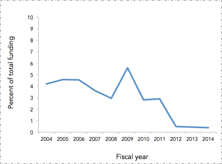
Figure 10. Proportion of NIH funded projects that included the terms "population" or "public" in their titles, FY 2004--2014.
NIH RePORTER. Search results for projects for which funding data are available. http://projectreporter.nih.gov/reporter.cfm Accessed November 20, 2014.
The picture here is clear. The U.S. is disinvesting in the social, cultural, and economic conditions that create health -- the core concerns of public health -- with attendant consequences for our poor national health indicators in the short-term. Bad as this is, it means we are positioning ourselves to do even worse in the long-term, as we decrease our research investment in these foundational concerns.
What exactly are these foundational concerns? A few examples.
Consider the role of income in determining health. Life expectancy has increased over time in the U.S., but only for certain people, with higher income groups gaining in life expectancy and lower income groups either not gaining, or losing. Figure 11 shows two birth cohorts--men born in 1930 and 1960--and estimates their life expectancy at age 50. As can be expected, the life expectancy for the 1960 cohort is higher overall than for the 1930 cohort. It is, however, lower for the poorest quintile of men, meaning that poor men born in 1960 can expect to have less life left at age 50 than their counterparts born in 1930. And this gap is widening. While the gap between the richest quintile and the poorest quintile for those born in 1930 was 5.1 years, that same gap is 12.7 years for those born in 1960. The health of populations is therefore tied closely to economics--health gaps and wealth gaps go hand in hand. It is also important to note that racial/ethnic divides in this country map frequently onto economic divides and are very much a part of the picture of health production in the U.S.
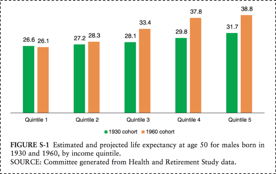
Figure 11.
National Academy of Medicine. The growing gap in life expectancy by income: Implications for federal programs and policy responses. 2015. http://www.nap.edu/download.php?record_id=19015# Accessed May 30, 2016.
Figure 12 further illustrates the existence of health gaps. While all other group mortality rates have declined since 1990, the mortality among U.S. white, non-Hispanics has increased. This is potentially due to an epidemic of non-intentional drug overdoses, largely attributable to the over-prescribing of pain medications in recent years. The cause-specific mortality rate from drug overdoses in the U.S. tripled between 1990 and 2006, and the burden of this increase has largely fallen on this vulnerable group.
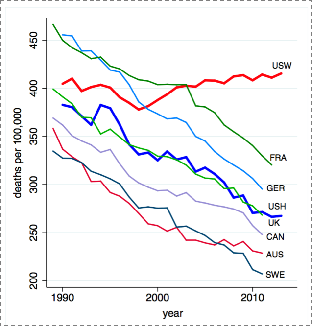
Figure 12. All-cause mortality, ages 45--54 for US White non-Hispanics (USW), U.S. Hispanics (USH), and six comparison countries.
Case A, Deaton A. Rising morbidity and mortality in mid-life among white non-Hispanic Americans in the 21st century. Proceedings of the National Academy of Sciences. 2015; 112(49): 15078--15083.
Culture is another key social determinant of health. Consider one of the past century's biggest public health milestones--the introduction of vaccines, which has saved the lives of millions of children. Figure 13 shows the dramatic decrease of measles incidence across the U.S. after the introduction of a measles vaccine in 1963. But recent controversy, and the rise of the anti-vaccine movement, has pushed back on some of this progress, despite no scientific evidence to back concerns. This has led to a recrudescence of measles cases around 2004, as shown in the darkening blue to the right of the graph.
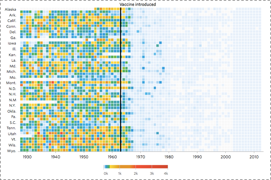
Figure 13. Heat map showing the number of cases of Measles per 100,000 people.
DeBold T, Friedman D. Battling Infectious Diseases in the 20th Century: The Impact of Vaccines. The Wall Street Journal, February 11, 2015. http://graphics.wsj.com/infectious-diseases-and-vaccines/ Accessed May 30, 2016.
The concerns of population health are emphatically global in scope, and the drivers of population health are as much rooted in the foundations of health worldwide as they are in the U.S. Figure 14 scales the world's geography by preventable deaths, showing how extraordinarily fortunate we are in our health achievement in the U.S. (and in our peer countries), and illustrating the heavy burden of preventable death in Africa and southeast Asia.
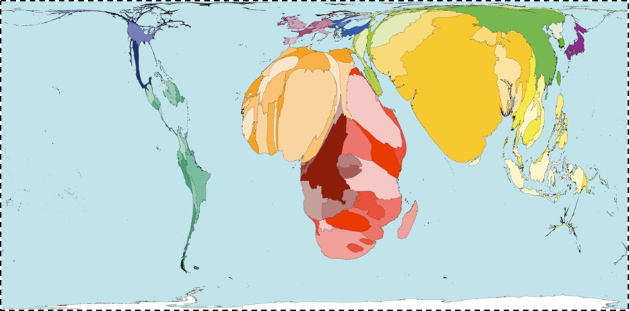
Figure 14.
Worldmapper. Interactive map: Land Area. http://www.worldmapper.org/display.php?selected=1 Accessed May 30, 2016.
It is perhaps not surprising, then, to note that this picture maps well onto the picture of global poverty (Figure 15); a stark reminder both of the disproportionate global burden of poor health in low-income countries, and the degree to which this poor health is tied to the economic status of these countries.
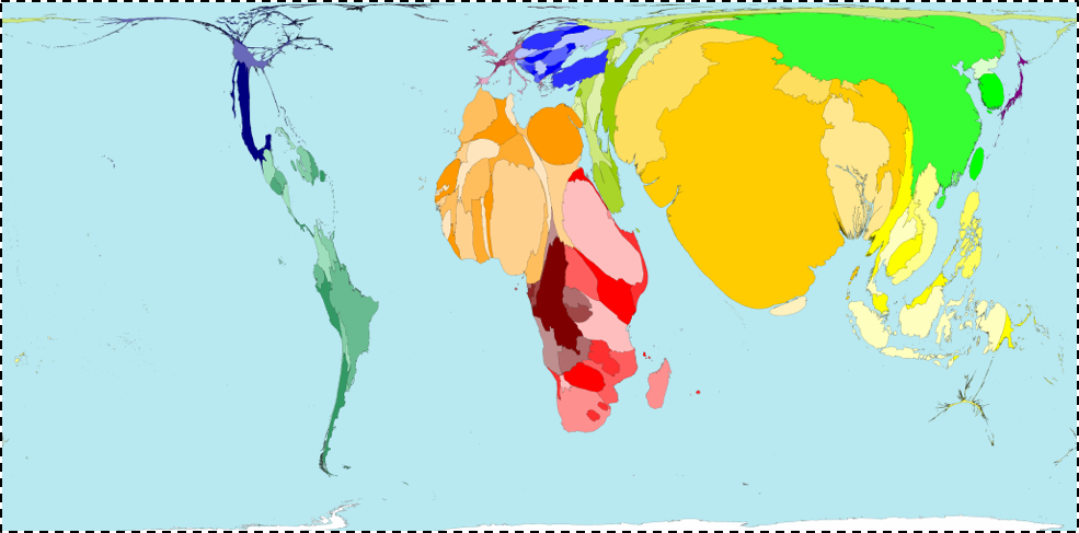
Figure 15.
Worldmapper. Interactive map: Land Area
http://www.worldmapper.org/display.php?selected=1 Accessed May 30, 2016.
A global perspective also gives us the chance to identify the international trends that are becoming ever more ubiquitous, and the forces with which we must come to grips if we are to improve the overall health of populations. Two central such forces, probably the two most important demographic shifts over the past century, stand out--urbanization and global aging.
Urbanization has increasingly characterized the conditions within which we live. Figure 16 shows in dark blue the countries that are projected to have more than 50 percent of the population living in urban areas by 2050. Almost every single country is in dark blue; this is a very different picture than we saw 50 years ago. On one hand, urbanization presents challenges--cities are characterized by pollution, overcrowding leading to infectious disease, and the strain of health systems. But because cities represent a ubiquitous presence in the lives of global populations, urbanization is also an opportunity to think about how we may create healthier cities to the end of improving the health of populations worldwide.
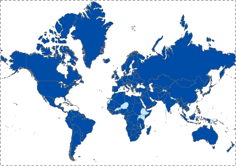
Figure 16. Countries with more than 50 percent of the population living in cities, 2050.
Population Division of the Department of Economic and Social Affairs of the United Nations Secretariat, World Population Prospects: The 2006 Revision and World Urbanization Prospects: The 2007 Revision. http://esa/un.org/unup
Coincident with the rise of urban living, the world is being transformed by an aging population (Figure 17). By 2050, the proportion of people over the age of 65 is projected to be about three times as large as that of people under the age of five. In 1950, these proportions were reversed. As with urbanization, global aging presents both challenges and opportunities in the area of population health.
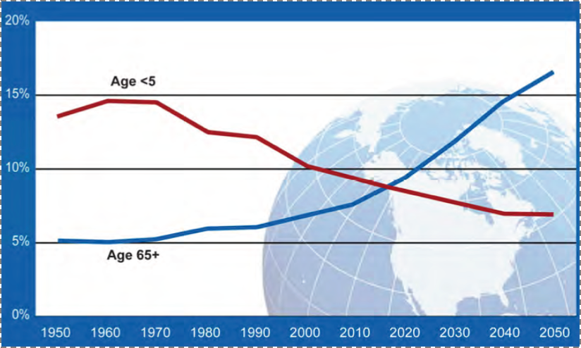
Figure 17. Proportion of global population by age, 1950--2050. Global health and aging.
National Institute on Aging, National Institutes of Health. U.S. Department of Health and Human Services, World Health Organization.
http://www.nia.nih.gov/sites/default/files/global_health_and_aging.pdf Accessed May 30, 2016.
These data are not meant to be a mere survey of the current state of population health. They are a call to action--action that is informed by the aspirations and strategies of public health.
History shows us what can be accomplished through such an approach. Figure 18 reflects one of the immense achievements of public health over the past century: the significant decrease in motor vehicle deaths in the U.S., even as the proportion of the population at risk--those who drive--has increased at about the same rate. This triumph was brought about not because we all suddenly became better drivers. Rather, we made it happen by acting on the conditions that surround driving--by improving cars and roads, by passing legislation that reduces drunk driving, and through the introduction of seat-belts and air-bags. This shows the potential of a public health approach that focuses on the conditions that we can change--on the possible.
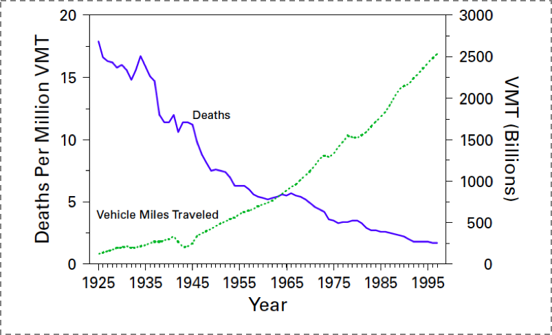
Figure 18. Motor-vehicle-related deaths per million vehicle miles traveled (VMT) and annual VMT, by year - United States, 1925--1997.
Motor vehicle safety: A 20th century public health achievement. MMWR 1999; 48(18): 369--374.
To conclude--a metaphor.
Suppose we care about the health of a goldfish in a bowl. We could advise the fish not to eat too much so it does not get fat, we could tell it to swim clockwise in its bowl so it gets enough exercise, we could even tell the fish to be careful with whom it consorts, so it does not develop bad habits. But none of this advice, whether followed by the goldfish or not, will make much of a difference if we forget to change the fish's water. And that is the role of public health: to shape the conditions that create health, so we might all lead fuller, richer lives.