
The RNC starts this week, so it’s off to the races. Coverage is going to be crazy, leaving our minds spinning I am sure. So I thought I’d take a different route, at least for today, and take a look at Presidential logos so far this election.
Logos are a tough thing. While they are meant to capture the public’s attention, and make a very specific statement about a brand, they are often misinterpreted and sometimes reinterpreted without the brand having any knowledge or control. Basically, people can and will see and say anything into a logo. Social media gives us all the platform to do it.
This is true of consumer brands we are very familiar with and also personal brands as well. Throw politics into the mix and you have the potential for a lot of drama.
So it’s no surprise that people commented, shared, and reacted to the new logo representing the Trump-Pence ticket. It was fast and furious, I can tell you that.
Here’s how it all started:

Then some folks had some “fun” with it:
And then Planned Parenthood (who’s had a bit of “history” with the ticket) got into the action:

Politics aside, pretty clever, actually!
At the end of the day, it looks like the campaign took the “feedback” to heart with a new logo that literally appeared the next day. No flag, no overlapping letters, nothing to stir up any drama, other than the tagline that Trump’s been using since the start.

Trashing logos is nothing new. Hillary got a lot of flack when she released her new campaign logo at the very start of the race. Some said it looked like a hospital and some said it was easily flip-flopped to show moving backwards instead of forwards. Like I said, anyone can see and say anything they want into logos. Who knows what’ll happen when she announces her running mate, which should be quite soon.

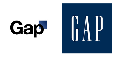
And this is certainly nothing new in the land of consumer products. GAP, for one, got a lot of social commentary when it changed its logo not too long ago. They aren’t alone in the feedback, that’s for sure. The commenting public for years has seen all sorts of mystical imagery in the Starbucks and P&G logos...with lots of commentary to go along with it.
As I mentioned, consumer brands are used to this kind of in-market response and generally do a lot of pre-market research when developing the logos to make sure they anticipate any positive or negative responses. These brands also work to make sure that the logo, whether new or evolved, best represents the essence of the brand.
I’m not sure that the Trump-Pence campaign did enough of that, but they certainly learned quickly.