Countless federal and local policies, especially the health care legislation, are being proposed and debated in Washington and across the country on an almost daily basis. Power players in these debates -- including Members of Congress, think-tanks and other organizations that have a stake in the legislation being debated -- must rely heavily on facts and figure to provide support for their stance on a piece of legislation. Ultimately, using these numbers serves to convince the American public of the stance being taken by the organization or individual.
While citing statistics -- like the anticipated cost of a bill or how it would impact an individual's federal income tax -- in a message adds credibility to an argument, it is often difficult for members of the public to fully grasp the meaning of these numbers because of a lack of context or background information. And, unless an individual is already adequately knowledgeable on a certain issue, referring to numbers can do more harm than good by adding even more confusion to already heavily academic subject.
The key to disseminating facts and figures that are vital to building support for an argument is through data visualization. Graphs and other types of charts can be very effective because, if they are done properly, they allow people to visualize the data being cited which makes the information presented more real and understandable.
But it's not enough to just produce the data visualization. There needs to be a coordinated, multi-channel distribution approach that focuses on persuading the audience to not only side with the position being promoted, but also to spread the information to their networks. This is the most effective way to use data visualization to have a real and effective impact on the debate at hand.
This type of approach was recently exemplified by Organizing for America's (OFA) in its efforts to build up support for President Obama around the one-year anniversary of the $787 billion stimulus.
While Republicans in Congress and conservatives across the country pointed to the nearly 10 percent national unemployment rate as proof that the stimulus had failed to create jobs and stimulate the economy, OFA -- an arm of the Democratic National Committee -- launched a coordinated campaign to persuade Americans that President Obama's administration had put the country back on a "Road to Recovery."
 The first - and main - aspect of OFA's efforts was a chart showing U.S. job loss statistics between December 2007 and January 2010. This allowed people to compare the number of jobs lost during President Obama's first year in office with the number of job lost during President Bush's last year in office.
Instead of spreading the chart as a PDF that a user would have to download to view, the chart was placed on a landing page on My.BarackObama.com. The page featured share buttons which enabled individuals to spread the chart through their networks on Facebook and Twitter and with their contacts via email with the click of a button.
Organizing for America also launched a web video which really took advantage of the easy-to-comprehend chart and explained the meaning of the numbers in a more engaging and compelling way.
The video convincingly portrayed the nation's economic situation under President Obama as much improved compared to the economic situation under President Bush. The ultimate point of the video was to convince the American public that small businesses and the unemployed are now receiving help from the government -- because of the stimulus package. This, in turn, was successful in stopping even more Americans from losing jobs -- in other words, it "saved" these jobs. If the chart itself didn't do enough to make the case for OFA, the video certainly helped to convince more people of the stance being presented.
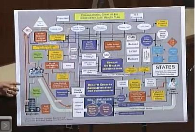 Republicans have also taken advantage of the power of strong data visualization to get a point across. One of the best examples is the House GOP's Health Care Maze. This graphic illustrated the bureaucratic complexity inherent in the House Democrats' proposed health care legislation. While this chart effectively portrayed the message that the House Democrat's health care plan would create a confusing bureaucratic nightmare for America, Organizing for America's multi-channel execution and deployment of its one-year stimulus anniversary chart took the campaign to the next level. Not only did it succeed in spreading the information in multiple channels, it also succeeded in engaging its supporters to help spread the content even further and show strong support for President Obama.
Any organization -- whether it is political in nature or not -- that seeks to convince the public to take a certain stance on a piece of pending legislation can benefit from strong data visualization. But it's not enough to merely produce a chart -- there needs to be a strategic, dedicated, multi-channel approach to spread the information and engage individuals in the debate.
David All is President of the David All Group and the founder of act.ivi.st, a platform for activism built on Facebook Connect. Indeed, he's on Twitter -- follow him.