
It has become somewhat of a management mantra: you cannot manage what you do not measure. And, yet, when it comes to the most pressing social problems of our day -- like hunger in America -- we need so much more than measurement. We need smarter, more collaborative data collection that bypasses organizational silos. And, we need to couple that data with creative, compelling info graphics that spur innovation and action. We need a Hunger Data Consortium.
Hunger is on the rise in America despite decades of government programs and private outreach. According to the most recent figures -- which are almost two years old -- over 49 million Americans suffer from food insecurity; 17 million are children -- which prompted President Obama earlier this year to challenge our nation to end childhood hunger by 2015.
To meet this challenge, we need greater awareness, understanding and advocacy of hunger and its implications. And, that requires enhanced collection, organization and utilization of hunger related data in America. While tremendous amounts of data are collected, it is often incomplete, dated and fragmented -- accessible only to researchers and policy makers, not the general public or local hunger advocates.
Benefits of a Hunger Data Consortium
A central, holistic source of data that includes data visualizers as modeled below and is accessible to all can provide important benefits to help solve the problem of hunger in America. 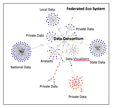
Benefits like:
- Identifying and closing information gaps -- particularly at the state and local level
- Facilitating the sharing of data -- allowing public and private entities and individuals access and utilization of the compiled data
- Initiating analyses and visualizations to raise awareness, introduce new perspectives, hypotheses and solutions
- Creating an eco-system of qualified, comprehensive data that organizations can work with when developing solutions
- Collecting and promoting solutions for peer review and collaboration across sectors to help drive both social and market-driven solutions.
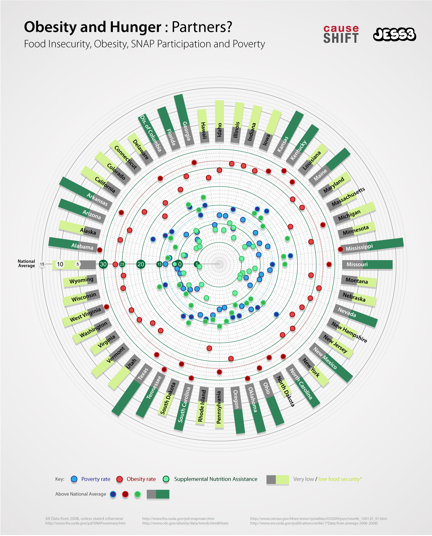
Utilizing currently available data from the U.S. Census Bureau, the United States Department of Agriculture (USDA) and the Centers for Disease Control (CDC), the info graphic looks at the rates of obesity, food insecurity, Supplemental Nutrition Assistance (SNAP) participation and poverty in the 50 states. It shows states with high levels of food insecurity also have high rates of obesity. In addition, 14 states have both higher than the national average rate of food insecurity and obesity. It also suggests that the current levels of SNAP participation are not high enough to keep food insecurity or obesity at low levels (see Mississippi, Missouri, Texas, Kentucky or Kansas for example)
What Data Can Provoke
While this info graphic doesn't answer all the questions as to why obesity and hunger are linked -- or how strong the links are -- visualizing data like this may help policy makers and researchers see the data in a different light and help provoke new thinking and solutions. For instance:
- Would a deeper understanding of the connections between hunger and obesity spur policy makers to re-write our nation's food policy?
- Would the publication of compelling info graphics generate greater awareness and concern among Americans and prompt them to become more involved in fighting hunger in their community?
These types of questions -- and more -- can be asked and answered with better data, analysis and presentation.
It's time we stop hoarding data in silos -- accessible only to a few. We need to create a Hunger Data Consortium and let everyone and anyone -- the government, non-profits, the media and interested individuals -- use it to test hypotheses and create new approaches to ending hunger in America.