If New York's buildings were as high as its residents are wealthy, the city's skyline would look vastly different. That's just what Nickolay Lamm set out to capture in a series of maps that were first produced on MyDeals.com.
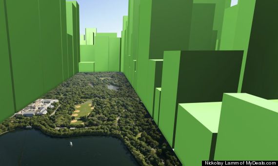
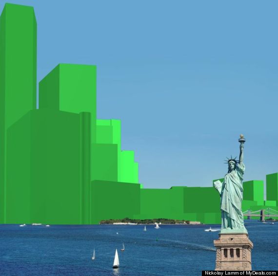
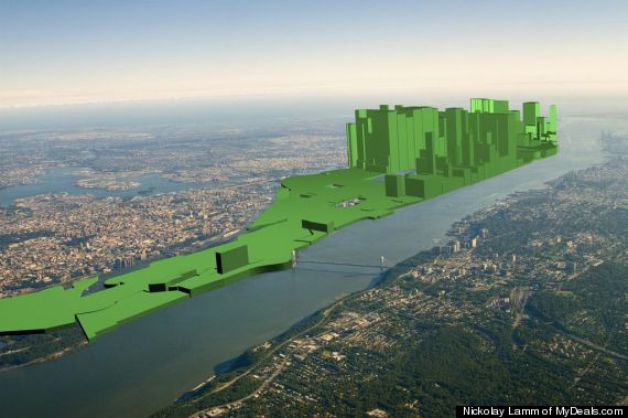
In an effort to visualize what wealth inequality looks like, Lamm superimposed bar graphs representing median household net worth onto a map of New York City. For example, an area with a net worth of $400,000 would be represented by a bar 4 cm high, while a neighborhood with a net worth of $50,000 would only be .5 cm high.
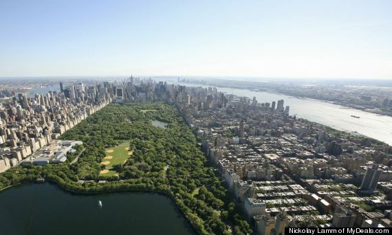
Here's a look at the neighborhoods that surround Manhattan's Central Park, where some of the wealthiest people in New York live:
And here is a visualization of the area's wealth:
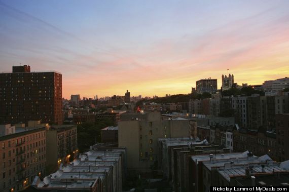
Just north of Central Park is Harlem:
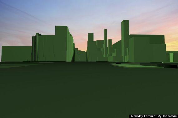
As you can see, Harlem's wealth is dwarfed by that of its surrounding neighborhoods:
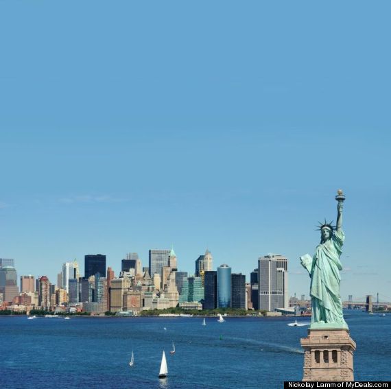
Here's the southern-most part of Manhattan, a.k.a. the Financial District:
And here's a rendering of the area's wealth:
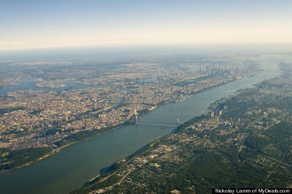
Finally, here is a view of all of Manhattan, with uptown in the bottom left corner and downtown in the upper right.
And here's the island as represented by its wealth:
To check our more of Lamm's visualizations, click here.
Correction: An earlier version of this post mistakenly reversed the orientation of the final set of photos. We regret the error.
Related
Before You Go
