DigitalVision Vectors/Getty Images
What are the most common UX pitfalls in mobile app design? originally appeared on Quora: the place to gain and share knowledge, empowering people to learn from others and better understand the world.
Answer by Patrick Dugan, Product Designer, on Quora:
A common pitfall in mobile application design is a reliance on a “hamburger menu” as a catch-all for common actions as well as for general navigation.
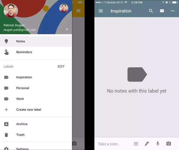
Looking at a comparison of two note taking applications, Google Keep and Todoist, the use of the hamburger menu and its negative implications are quite apparent.
Focusing first on Google Keep, the applications navigation bar is crowded with unlabeled icons whose actions are not made clear to users. One of these icons, the hamburger menu, is where Google Keep stores navigation points into such screens as Notes, Reminders, Archive, Trash, and Settings.
Additionally, inside the hamburger menu is where users can access the application’s Labels feature (synonymous with folders).

Conversely, the application Todoist features no hamburger menu at all.
Navigation points into screens such as Folders, Labels, and Filters take the form of a tabbed navigation controller which is visible from the application’s home screen.
The application's navigation bar features entry points into Notification and Settings screens when on the home screen, and is replaced with Folder and Label titles once a user drives down into the application’s hierarchy.

The benefits of Todoist’s decision to eliminate a hamburger menu altogether are numerous, and include:
- Easier discoverability of features. There is a large body of research which suggests many users never look inside hamburger menus. Todoist surfaces its applications primary features in a highly visible fashion whereas Google Keep places entry points into large portions of its applications surface area into an undiscoverable menu.
- A more consistent information hierarchy. Users of Todoist are able to understand that Projects, Filters, and Labels are all equal means of sorting and organizing content. Inside of Google Keep however, the information architecture and relationship between Labels, Notes, and Reminders is muddled both visually and through each feature's respective placement.
- The ability to more easily navigate throughout an application and complete common tasks. Todoist features inline actions appended to the bottom of lists and makes use of a contextual Floating Action Button when appropriate. Google Keep, however, inserts common actions into the applications Navigation Bar, Tab Bar, and Hamburger Menu. In doing so, users likely would have difficulty understanding either how to complete an action, or where they should even look to do so.
The hamburger menu is featured prominently in most of Google’s first party iOS and Android applications, and this is likely because it’s a cornerstone of Google’s Material Design framework (in which it is referred to as a navigation drawer).
I’ve generally found that incorporating a hamburger menu into an application’s information architecture ultimately leads designers to act lazily.
Rather than focus an application’s primary use cases or attempt to truly understand ways to effectively allow users to navigate throughout an application, a hamburger menu allows designers and product mangers to add new features or screens within an application that have the ultimate effect of making said application harder to learn, use, and understand.
This question originally appeared on Quora - the place to gain and share knowledge, empowering people to learn from others and better understand the world. You can follow Quora on Twitter, Facebook, and Google+. More questions:
