
Were Christmases of yore actually more merry and bright? Or were Grandpa's tales of walking uphill both ways through five feet of snow to drag home the family Christmas tree a wee bit embellished?
Over at the National Oceanic and Atmospheric Administration, experts set out to settle that score. With help from the Rutgers Snow Lab, they analyzed satellite images of Christmas weeks over the past five decades. And they discovered our memories might be a little more rose-tinted than we thought.
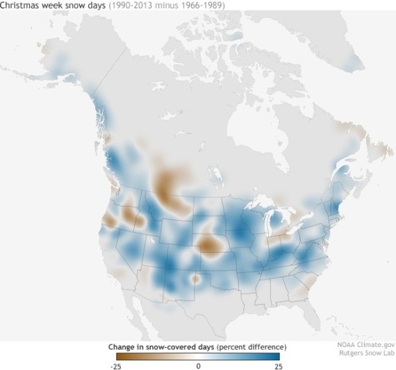
The map below shows the percent change in snow-covered days over the week of Christmas between 1990 to 2013 and 1966 to 1989. The color blue indicates areas where the ground was more frequently snow-covered in recent years. Brown indicates areas where Christmases in longer-ago decades were indeed whiter.
As you can see, fans of glistening tree tops have had a better time in the past few years -- there seem to have been more white Christmases between 1990 to 2013 in the U.S. Take that, beloved elderly relatives.
The folks at NOAA would also like you to know that this chart indicates nothing about broader trends in climate change. It is still, unfortunately, getting warmer.
Related
Before You Go
