
Our screens are flooded with data every single day.
And the surge isn’t slowing down anytime soon. According to IDC’s Annual Digital Universe Study, the amount of data around the globe is anticipated to increase tenfold by 2020.
This represents a MASSIVE influx of information.
And while this data is critical for making effective business decisions, it can be paralyzing in its raw form. Too much data can be just as incapacitating as no data if it’s not organized in an easily digestible layout.
This is where visualization comes into play. Innovative technology has made it possible for business professionals to view real-time data with visualizations that reveal the story behind the numbers.
You no longer need to resort to guesswork when it comes to future business initiatives.
This guide will explain how data visualization works, examine who stands to benefit the most from it, and outline 23 different types of data you can visualize to gain incredibly powerful insights.
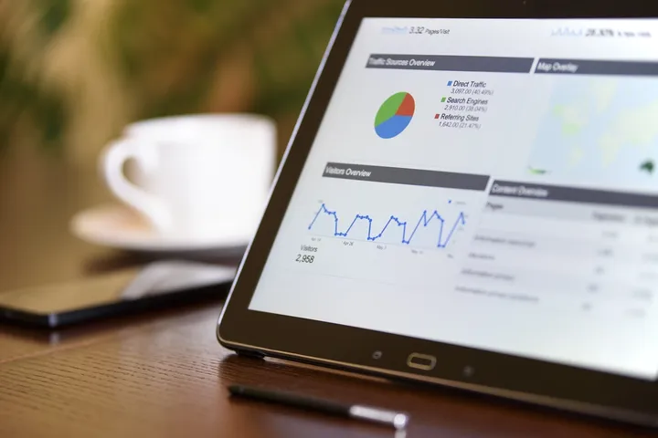
Data Visualization: What is it?
Data is usually presented in a text-based format after its initial extraction. With data visualization, information is presented in a visual context to enhance understanding around key metrics and cut down on time required for analysis.
Patterns, trends, and correlations that might otherwise go unnoticed become easily discernible in this visual environment.
This is typically achieved through dashboarding.
Dashboards make it possible to organize key performance metrics so that they can be analyzed, monitored and used to make critical business decisions. Some of the visual components that they employ include:
- Charts
- Sliders
- Gauges
- Checkboxes
- Maps
- And More
The types of dashboards available can vary greatly, but there are three primary kinds of dashboards. They consist of:
- Operational Dashboards: This type of dashboard is mainly used for monitoring purposes. This can include keeping track of events, processes, activities and goal completions as they occur in real time.
- Strategic Dashboards: These dashboards are also referred to as scorecards and are usually organized in a top-down fashion to view the progress that is being made toward the achievement of planned business objectives.
- Tactical Dashboards: If you need to measure and analyze the performance of specific activities, processes, and projects, then the tactical dashboard is an ideal option.
Now that we’ve outlined the basics of how data visualization is used, let’s move on to explore who uses it the most and the benefits associated with it.
Who Should Use Data Visualization?
The applications of data visualization are so broad that there are very few, if any businesses, that would not benefit from it. However, there are some key roles that find it especially useful for their distinct purposes.
The following list outlines some of the chief individuals that may want to take advantage of data visualization:
- Executives — Waiting for reports -- overflowing with the biases of every department -- can result in corrupt data, Data visualization allows you to see both the high-level data and granular metrics that you need to base your decisions on in real time. View your data on any device, wherever you may be, to maintain visibility into your organization while empowering your team to act on your insights.
- Managers — Without the right tools to manage your people, it can be more than a little challenging to deliver optimal results. Visual dashboards simplify the process of communicating with both executives and employees while providing you with real-time insight into the day-to-day happenings. Benefits like the ability to collaborate around real-time data, share files in one central location, and import data from 3rd party applications can have an immense impact on business communication. When you bring your department’s data together with metrics from all areas of your organization, you can witness the precise ripples that stem from your decisions.
- Analysts — When your job depends on transforming raw data into actionable insights, the tools at your disposal are a crucial component for delivery. Bringing your data together and viewing it with customized visualizations has the potential to significantly cut down on time spent combing for insights. Eliminate manual reporting, share your discoveries and get real-time feedback.
Relaying data to the individuals that need it is practically unfeasible when you’re trying to collect and make sense of the scattered information in your organization. You can now sync your data on one platform and transform it into intuitive visualizations that give you the edge you need to transcend expectations.
What Am I Missing Out On?
Data is key to making solid business decisions.
By manipulating this data into visualizations, we can eliminate the frustration of attempting to navigate scattered reports and dig right into the meat behind the numbers. Some of the chief benefits of data visualization include:
- Simplified Business Collaboration: Maintaining an accessible and secure data platform allows for unhindered communication to keep everyone connected throughout the process. Exchange information with team members through private and public messages, file and data sharing, and data extraction from third-party applications.
- Real-Time Access: This benefit applies to both extraction and collaboration.The ability to access your data as it's flowing in, and share it with your team, makes it possible to execute business strategies just as the opportune moment presents itself.
- Closed-Loop Attribution: Leaky data can wreak havoc on your campaigns and deplete marketing budgets without producing any tangible results. With data visualization, you can clearly tie your investment to revenue and optimize your strategies to ensure optimal outcomes. Real-time insights are no longer a luxury in this rapidly shifting business climate, they have become a necessity.
- Feeding the Bottom-Line: Take action that is supported by data. Visualizing the data around your campaigns makes it possible to quickly distinguish the activities that are generating results from those that are not. Once you have this insight, you can focus your marketing dollars on the most fertile channels and see an immediate lift in ROI. And when you can demonstrate the value that your chosen strategies are bringing to the bottom line, the question of where to direct additional resources will require very little contemplation.
- Notifications Around Key Metrics: Unanticipated market fluctuations can result in significant losses or missed opportunities. Even a lag of fewer than 24 hours can have a major impact, which is why the advantage of timely alerts and notifications cannot be overstated.With data visualization, you can pinpoint key metrics and thresholds and then create alerts around them to notify you of changes that require swift action.
- Seamless Accessibility: Your team may use a broad array of tools but the data from each channel should be easily accessible from one centralized platform. Modern professionals need a seamless connection to their data. And with the right data visualization tools, you can tap into this information wherever and whenever you want to consume it.
- Customized Data Delivery: When it comes to data, there is no such thing as one-size-fits-all. The right tools make it possible to satisfy your unique business needs by giving you the ability to import your data from any source and compile it into custom visualizations.
Every business professional will make use of their data visualization tools differently, which is why we created the following list. Here are 23 types of data you can customize to satisfy your business needs and goals.
23 Types of Data You Can Enhance with Visualizations
What types of data can we extract the most value from with visualizations?
- Web Analytics Metrics: Import data from your tool of choice, such as Adobe, IBM, or Google Analytics and manipulate the data however it suits you. When you visualize this valuable data, you can quickly and easily identify patterns around your visitor’s behavior and match this data up with other systems to make informed business decisions.
- Data Consolidation Tools: Tools that give businesses the ability to consolidate and interpret their data, such as Adaptive Insights, can be further enhanced with visualization. When these elements are brought together, teams can move forward with a single version of the truth.
- Cloud-Computing Services: Import the data from a cloud-computing service provider, such as Amazon Web Services, and transform your complex data into clear visual representations. Build your visual dashboard to immediately extract critical insights and determine business impact.
- Project Management: Monitoring and managing employees, tasks, goals, issues, and other project management stats is simplified through data visualization.Whether you need to gain a more holistic view of an individual employee’s performance, your team’s progress or your entire organization, you can use data visualization to make fast and thorough assessments. When you import your data from tools like Workfront, Basecamp, Harvest or Jira, you can watch the data flow into your dashboard in real-time and move forward accordingly.
- Paid Search Marketing: Can you quickly attribute business revenue to specific marketing touchpoints? Viewing real-time data from your paid search campaigns makes it possible to really drill down into performance and ROI. Whether you are identifying trends in AdWords, Bing or content promotion tools like Outbrain, closed-loop reporting becomes a reality, as you pull and compare data from marketing, sales, finance, and operations. As key ad metrics hit predetermined thresholds, email, and SMS alerts give you adequate time to respond and take advantage of passing opportunities.
- Files: Rather than spending hours combing for data in CSVs and other popular file formats, import the information stored within them and quickly transform it into easy-to-understand visualizations. Avoid data silos and enhance collaboration with a unified version of your information that is accessible to your entire team – even on-the-go.
- Worksheets: Spreadsheet calculations in Excel and Google Sheets contain pages of essential data, but they are not the best way to share and communicate it. By combining and visualizing the data contained in these sheets, your team can easily spot the insights within them to make better business decisions.
- Social Media: Connecting the dots between your social media efforts and the ROI for your business is not always simple. When you compare the data from Facebook, Twitter, Instagram, and social media tools like Klout and NetBase, it all becomes much clearer. Pair these insights with metrics from the rest of your marketing systems so that you can focus your efforts to achieve the best return.
- Surveys and Customer Insights: The feedback we get directly from our customers can be immensely valuable – especially when it is compared with analytics and other relevant business data. Tools like SurveyGizmo, Fluid Surveys, Survey Monkey and Qualtrics help you gather this information. When you add data visualization to the mix, you can view survey results in a way that allows you to shine a light on your business decisions. This clear picture helps us fix problems and take advantage of the most promising opportunities.
- Developer Data: Your development process is dependent on the right tools, processes, and actionable data. Connect real-time insights from Github, Microsoft SQL or Rally, and transform them into intuitive visualizations. From planning to execution, you can start leveraging the right data to streamline your way to completion.
- Marketing Automation: Marketing without data is a thing of the past -- and marketing without visualizations is a headache. Pulling all your marketing data into a robust, visual dashboard makes it incredibly simple to execute data-driven decisions and follow them up by demonstrating your contributions to the bottom line. By merging and visualizing the insights from your platform of choice, such as HubSpot, Eloqua, Pardot, Marketo, you can identify trends around leads, identify outliers, track marketing initiatives, simplify collaboration and enhance campaign performance.
- Business Data Management: There is a lot of pressure to make the right business decisions. Tools like Hubsoft and Zuora simplify this process by helping you manage the data associated with them. Pulling this data into a platform that gives you a clear, visual representation of your information, further expedites the decision-making process. Gain a complete understanding of your order processes, sales metrics, and revenue sources as you watch all the parts move together to bring you results.
- Sales CRM: There’s no question that your CRM solution holds a ton of precious data. From managing customer relationships to driving sales with an accelerated pipeline, the information that is housed there is absolutely vital. Now when you extract the data from your favorite CRM such as Ivinex, SugarCRM, Inside Sales, or Salesforce, and compare it with marketing, finance, and operations visualizations you can finally get the detailed answers you need.
- Accounting Data: Rich visual analytics enhance the data pulled from your accounting software to give you financial transparency and heightened insight. Whether you are managing your financials with accounting software like Intacct or QuickBooks, visual representations of Enterprise Resource Planning (ERP) data translates to powerful reporting and decision-making capabilities.
- Application Intelligence: Tools like Loggly, mine through your application data and reveal what’s going on with them and why it’s happening. With the right data visualization platform, you can merge and compare that data with metrics from other areas of your business for a flawless finished product.
- E-Commerce Platforms: The data around your e-commerce store plays a large role in customer experience management and business growth. Platforms like Shopify and Magento are used by some of the biggest names in digital commerce, which requires the management of all sorts of data. When you create a personalized visual dashboard to represent this information, you can quickly identify trends, pain points and potential opportunities in real time.
- Email Marketing: Understanding the people that make up your lists of subscribers and leads is a critical component of effective email marketing campaigns.With tools like Emma and Mailchimp, marketers are growing their email lists, building smarter campaigns and driving conversions. With customized visualizations, they are syncing their campaign data with other critical business metrics to power their decision-making capabilities.
- Software and Hardware Analytics: Executives, business leaders, and technologists rely on the data found in their software and hardware systems to make decisions about a vast array of areas. Whether you are using a tool like New Relic to understand your software analytics, or taking advantage of an integrated hardware and software system like Oracle, extracting the right information can be time-consuming. When all of this data is pulled and organized into a visual dashboard, the comprehensive insight gained makes it simple to move forward with confidence.
- Enterprise Applications Software: With the right enterprise software solution, you can dig into the data around things like consumer behavior and market intelligence. Managing customer relations and business operations with a product like SAP, or any other type of enterprise software, can help you run your business more efficiently on your upward trajectory. Real-time data visualizations streamline this process by connecting you to your data in a way that allows for rapid comprehension and simplified collaboration.
- Payment Processing: In order to effectively run the financial side of your business, you need access to the right data. With tools like Square, you can take payments on-the-go and manage your open tickets, digital receipts, inventory, payroll, and a range of other activities associated with your business financials. Digest this data by viewing it with visualizations that automate your reporting and make it easy to identify order trends, cost breakdowns, fees, revenue and other relevant information you need to make smart decisions.
- HR Management: Managing your talent, billable hours, performance and team goals requires some serious monitoring and analysis. With the best HRIS software, and tools like Taleo and Toggl, you can collect and keep track of this valuable data. With data visualization, you can zero in on key metrics and compare them to other areas of your business to gain a truly comprehensive view of the happenings within an organization.
- Communication: What role does communication play in your business? Phone calls, voice, and video, messaging and general connectivity Twilio, employ this data through apps to provide instant lead alerts, appointment reminders, mask phone numbers, cut hold times, track phone calls and more. When you visualize this information, you can see the communications data in real-time, eliminate scattered messages and sync it with the rest of your organizational efforts.
- Customer Data: The data around your customers is arguably some of the most important information a business has. Whether you want customer behavior insights through tools like Webtrends, track data tied to customer service with Zendesk, or simply want to monitor and analyze data from review sites like Yelp, the ability to visualize this data is priceless. A holistic view of your customer’s needs, interactions, problems and related information makes it possible to see how your business decisions affect customers as they are executed.
Conclusion
Your data has more to offer than you might realize.
Extracting the insights that it holds is dependent on your ability to access it -- wherever you might be -- organize it, compare it, and collaborate with your colleagues so that you can take action.
Rather than keeping your data in silos, you can pull all of it into a single platform and transform it into visualizations that meet your precise business needs.
Get notifications when your metrics hit predetermined thresholds and view your data in context with everything else that is taking place in your organization so that you can make more informed decisions.
Are your ready to meet the answers to your most pressing business questions?