Every year, when the BP Portrait Award comes along I make a trip to the National Portrait Gallery in London to see it. And every year, the same discussion comes about with whomever I am perusing the exhibition with (usually my significant other, who I might add for the sake of this discussion, is a photographer): If a photorealistic painting wouldn't make a good photograph, does it make it a good painting? And, having seen two impressionable photography exhibitions in London the same week--Sally Mann at the Photographers' Gallery and Wolfgang Tillmans at the Serpentine Gallery--the counter question arises: When photographs look painterly, does that offer a unique quality to a photograph? Perhaps photography, the newer art form, has an unfair advantage.
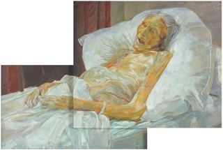
Last Portrait of Mother by Daphne Todd © Daphne Todd
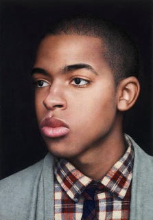
Harry by Michael Gaskell © Michael Gaskell
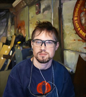
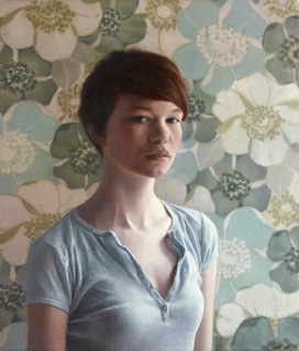
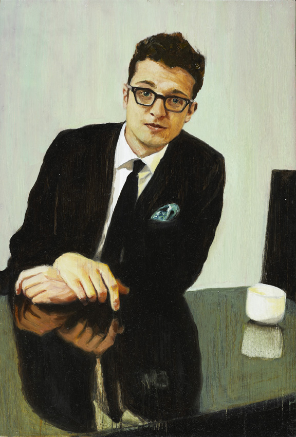
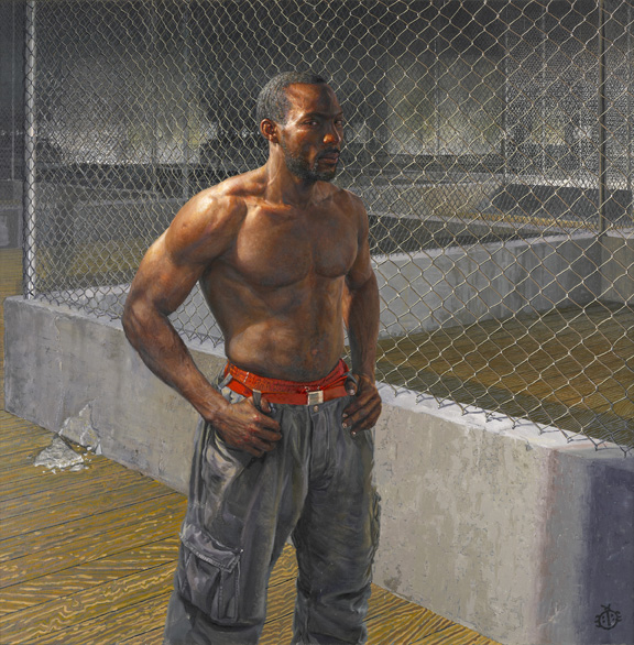
Tim II by David Eichenberg © David Eichenberg
This year's BP Portrait Award winner went to a painter's painter, Daphne Todd, for her portrait of her dead mother, titled Last Portrait of Mother. The second prize was awarded to Michael Gaskell for a less-than exciting (or chilling, as in the case of Todd) but skillful portrait of a young man named Harry. But it's the third that struck me, in a semi-irritated way: David Eichenberg's Tim II is painted so that the artist was clearly copying a photograph. Yes, many painters use photographs as a tool or a guide (David Hockney even argues that this tool has been used by artists for hundreds of years through the use of lenses and optical devices) but when a painter simply copies a photograph, I feel cheated. In Eichenberg's work, he mimics the shallow depth of field, which is a lens-based quality. In other works you might see the on-camera flash technique used by such fashionable art photographers as Juergen Teller and Ryan McGinley. (An example of this is the painting below, by Oscar Burnett, titled The Player? though this at least offers depth on another level, i.e. the pattern of the William Morris wallpaper in the background, a nod to Morris, Peyton and on-camera flash all in one.)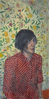
But Eichenberg's painting--its composition, light, subject--in any photographic terms would be the equivalent of a snap, an insignificant photograph. So then is it an exercise in painting technique and nothing else, or a comment on the photographic medium? Just to stress this question, when compared to some of the other exhibitors in the show, i.e. a painting where a there is clearly a style (for example, the two works below, Gillian by Miriam Escofet and Blue Coco by Shaun Downey) 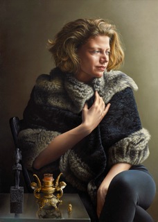
and the personality of the subject comes through the brush strokes, natural light source, colors; or even a work that looks like it could have been pulled from a film still, like The True Self-Portrait by Carlos Muro, 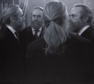
which offers an interesting composition and fascinating almost-pixilated painting technique. So while I quite enjoyed the exhibition, particularly Todd's work and the works just mentioned, the realist portraiture-versus-photography question continues to bother me (and I know I'm not the only one).
That said, and just to heighten the discussion, upon visiting the Wolfgang Tillmans' show at the Serpentine and seeing his inkjet prints that look almost painterly, I had a different feeling altogether. Perhaps because photorealist painting depends partly on the awe of painting looking so real, the photograph has less leeway to dupe a viewer (though Tillmans has been known to dupe, for example works in an Andrea Rosen show a couple years back where he placed exposed light sensitive paper, usually rubbish to a photograph, and put it in a Plexiglas box), or perhaps it's that viewers are less sympathetic to photographers as they may be toward painters. Let's take Tillmans' work Heptathlon, 2009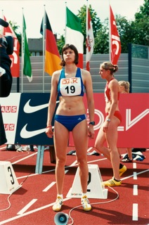
(Courtesy the artist and Maureen Paley, London), a beautifully composed and straightforward photographic portrait of a young runner taking part in an international competition, or Nanbei Hu, 2009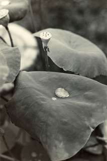
(Courtesy the artist and Maureen Paley, London), an elegant and subtle black-and-white still of Chinese lotus leaves in Nanbei Hu. In the same way a viewer might examine a painting to see if it is in fact a painting or a photograph (we've all done this), one might do the same with these works. The show varies considerably in style of work, and in this particular case it's a wonderful quality that doesn't undermine the cohesiveness of the show or his body of work to date, because Tillmans has a true gift for using photography as both medium and process, exploring its boundaries in every direction. Take for example his gorgeous Ostgut Freischwimmer, right, 2004, and Urgency XXII, 2006 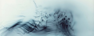 (Ostgut Freischwimmer, right, 2004. Courtesy the artist and Maureen Paley, London),
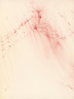 (Urgency XXII, 2006. Courtesy the artist and Maureen Paley, London), which evoke abstract paintings--a haunting surface looks like a brilliant thunder storm and/or evoke Richter-esque paintings; it was most likely achieved by using fiber-optics or another light form skittered across light sensitive paper. Again, it has a painterly quality but achieves a purpose much greater than just looking like something else. It is unlike other photographs and for that reason, aesthetically stunning.
In all of Tillmans's works, whether they look like an abstract painting through the use of photography as the medium, or it looks like portraiture in a painterly fashion through the use of the inkjet printer, composition and subject, light and innovative use of medium has to hold its own as a photograph before it can even be considered painterly. I'm including some more photographs from the Tillmans show and BP Portrait Awards below. And I'd love to hear from readers on the aforementioned questions: If a photorealistic painting wouldn't make a good photograph, does it make it a good painting? And When photographs look painterly, does that offer a unique quality?
From the BP Portrait Awards, The BP Young Artist Award 2010 to Elizabeth McDonald for Don't Be Too Serious © Elizabeth McDonald
From the BP Portrait Awards, The BP Travel Award 2010 was awarded to Paul Beel for Free David © Paul Bee
From the BP Portrait Awards, Le Grand Natan by Daniel Enkaoua © Daniel Enkaous
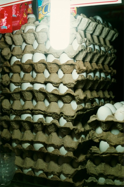
Wolfgang Tillmans, Eierstapel, 2009. C-type print, 61 x 50.8 cm. Courtesy the artist and Maureen Paley, London

Wolfgang Tillmans, in flight astro (ii), 2010. Inkjet print, 207.5 x 138 cm. Courtesy the artist and Maureen Paley, London
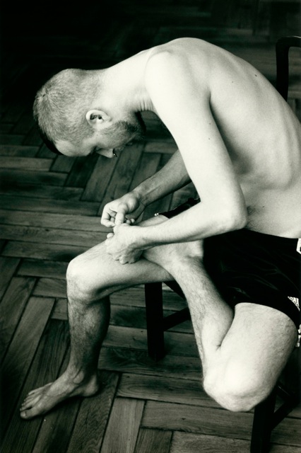
Wolfgang Tillmans, Anders pulling splinter from his foot, 2004. C-type print, 61 × 50.8 cmCourtesy the artist and Maureen Paley, London
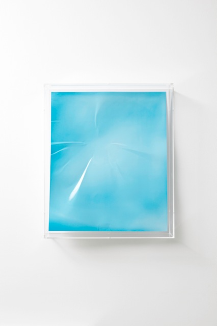
Wolfgang Tillmans, Lighter, blue concave I, 2008. Unique C-type print in Plexiglas. Hood, 64 × 54 × 12.5 cm. Courtesy the artist and Maureen Paley, London